

Background
NTU Scuba is a club in Nanyang Technological University (NTU), Singapore, that specializes in facilitating scuba diving certification programs for NTU students and staff. NTU Scuba works with external dive operators to organize dive trips both overseas and locally, with the goal being to make scuba diving more accessible to the NTU community.


REBRANDING
Although previously being known as NTU Dive Team, we had to change our club name due to some technicalities. As the chief publicity officer for (then) NTU Dive Team, I was tasked with the rebranding effort, which would involve the inception of both a new club name and logo.
RENAMING
I wanted the new name to be short and catchy but descriptive, such that it would be easy to remember, while at the same time effectively communicating who we are and what we do. Eventually "NTU Scuba" was chosen; "NTU Dive" was considered but not adopted, as there was already another scuba diving club in another local university with an identical name format. Furthermore, the word "dive" could potentially be associated with other forms of diving, such as high diving or freediving.
LOGO DESIGN
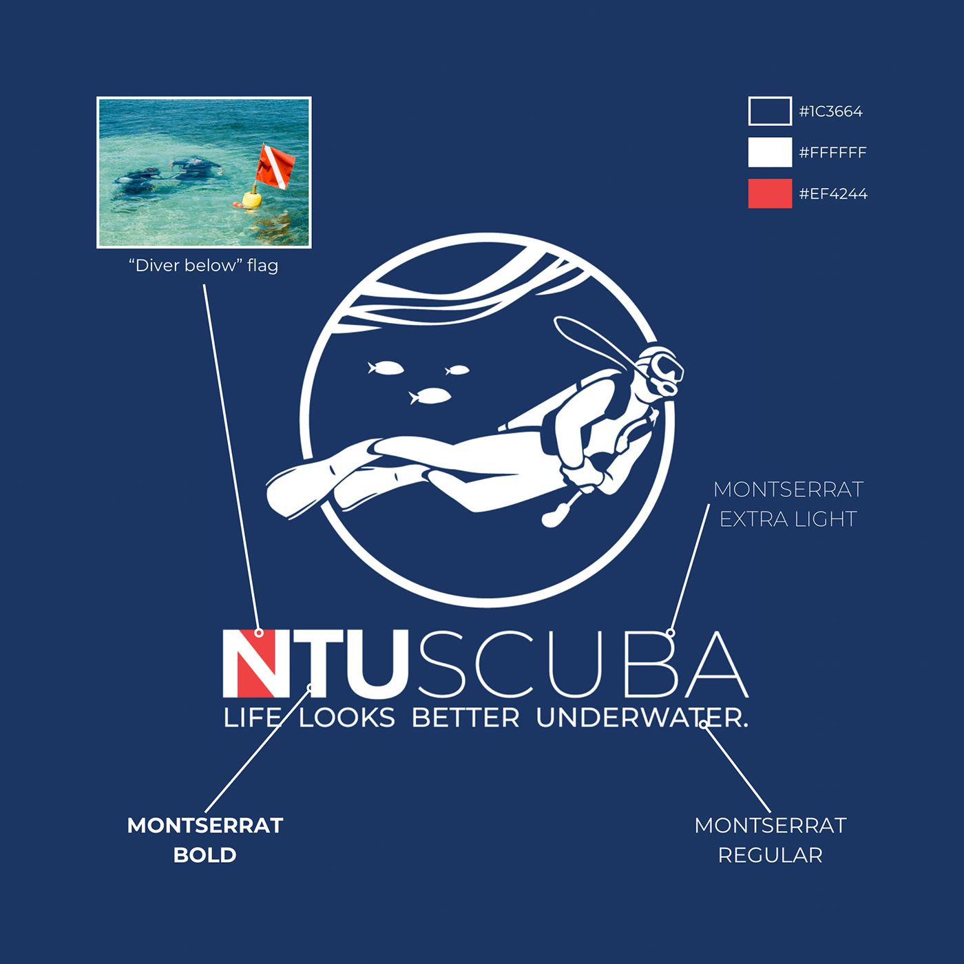
The vision I had for the new logo was a sleek, modern design, with scuba diving and ocean elements. I initially played around with the same diver and coral graphics that were used in my previous NTU Dive Team committee T-shirt and jacket designs. However, I found it to be a bit lacking in detail, so I drew my own diver graphic from scratch. Different shapes and configurations were explored; the various iterations can be seen below, arranged in chronological order from left to right and top to bottom. For some of the earlier iterations, I took inspiration from round unit patches worn by military pilots. Eventually I settled on a round logo, omitting the coral graphics for a cleaner look, and incorporating a wave graphic and simple fish silhouettes.
In keeping with the clean and modern aesthetic, the Montserrat font family was used: bold for the “NTU” and medium for “scuba” and the slogan below. In addition to being an accent colour, the red backing on the N also symbolises a “diver below” flag. This is a red flag with a diagonal white band, usually flown from a buoy over a dive site as an indication to boaters to exercise caution as there are divers in the waters below. However this was only implemented with the white version of the logo.


TOOLS USED
Adobe Illustrator, MediBang Paint pro


